prepare a XenSPEP for ggplot2 visualization
Value
a list with components `bounds` (data.frame including relevant colData rows (all colData variables) and cell boundary coordinates) and `txdata`, a filtered arrow Table.
Note
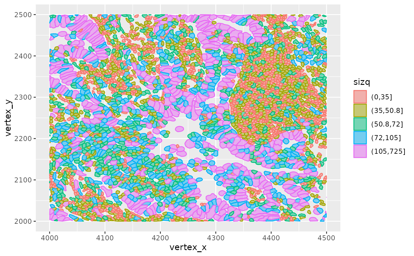
This is idiosyncratic. Quintiles of cell_area are produced, and transcript locations are filtered. A more general approach that allows selection of coloring of cells by feature characteristics is needed.
Examples
pa = cache_xen_luad()
luad = restoreZipXenSPEP(pa)
hh = ggprep_seg(luad, c(4000,4500), c(2000,2500))
ggplot2::ggplot(hh$bounds, ggplot2::aes(x=vertex_x, y=vertex_y, group=cell_id,
    colour=sizq, fill=sizq)) + ggplot2::geom_polygon(alpha=.5)