BiocPBG: application of PyTorch biggraph in single cell multiomics
Vincent J. Carey, stvjc at channing.harvard.edu
December 20, 2023
Source:vignettes/BiocPBG.Rmd
BiocPBG.RmdIntroduction
Inspired by the SIMBA algorithm of the Pinello lab (paper, github), this package illustrates the use of embeddings produced with PyTorch-BigGraph (paper, github) in the analysis of single-cell experiments.
Prerequisites
Python 3.10
There is a bug in the base PyTorch-BigGraph distribution from facebook research. A ‘patched’ version is available at https://github.com/vjcitn/PyTorch-BigGraph. Clone that repo and use branch vjc_idx_fix_gpu. The use pip install -e . in the repo root folder with the version of pip that installs to the locations employed by reticulate. Set RETICULATE_PYTHON if necessary to ensure that the right version of python is used.
R 4.3+
To use this package with R 4.3 or later, be sure that the R packages devtools, remotes, reticulate, and BiocManager are available. Then the package can be installed with
BiocManager::install("vjcitn/BiocPBG")RNA-seq example
Building the embeddings
The SIMBA tutorials include a jupyter notebook working through the embedding of RNA-seq results on 2700 PBMCs. We used a GPU-enabled machine in the NSF ACCESS Jetstream2 system (allocation BIR190004) to create 50-dimensional embeddings of cells and genes with a script. The primary outcomes are in a stored R list called nn50.
## List of 7
##  $ cemb  : num [1:50, 1:2700] 0.1075 0.2447 -0.2391 0.2248 -0.0703 ...
##  $ gemb  : num [1:50, 1:4780] -0.0419 -0.1649 -0.1178 -0.1588 0.1815 ...
##  $ cents : chr [1:2700] "GACGTATGTTGACG-1" "CGTGTAGACGATAC-1" "GGCGGACTCTTGGA-1" "CTAGGTGATGGTTG-1" ...
##  $ gents : chr [1:4780] "KIF3A" "DNAJC14" "IL6" "ENHO" ...
##  $ stats :'data.frame':  50 obs. of  11 variables:
##   ..$ lhs_partition              : int [1:50] 0 0 0 0 0 0 0 0 0 0 ...
##   ..$ rhs_partition              : int [1:50] 0 0 0 0 0 0 0 0 0 0 ...
##   ..$ index                      : int [1:50] 0 1 2 3 4 5 6 7 8 9 ...
##   ..$ stats.count                : int [1:50] 12906000 12906000 12906000 12906000 12906000 12906000 12906000 12906000 12906000 12906000 ...
##   ..$ stats.metrics.loss         : num [1:50] 16.2 16.2 16.2 16.2 16.2 ...
##   ..$ stats.metrics.reg          : num [1:50] 0.000992 0.000586 0.00055 0.000527 0.000515 ...
##   ..$ stats.metrics.violators_lhs: num [1:50] 543 533 532 532 532 ...
##   ..$ stats.metrics.violators_rhs: num [1:50] 543 532 532 532 531 ...
##   ..$ epoch_idx                  : int [1:50] 0 1 2 3 4 5 6 7 8 9 ...
##   ..$ edge_path_idx              : int [1:50] 0 0 0 0 0 0 0 0 0 0 ...
##   ..$ edge_chunk_idx             : int [1:50] 0 0 0 0 0 0 0 0 0 0 ...
##  $ call  : language sce_to_embeddings(sce = t3k, workdir = "myfold50b", N_EPOCHS = 50L, N_GENES = 5000L,      N_GPUS = 0L, BATCH_SIZE| __truncated__
##  $ config:<pointer: 0x0>
The config element can be useful in interactive computing in a given R/reticulate session. After serialization, the element is a null pointer.
See the appendix for additional details on the formation of the input data, which involves discretization of normalized expression measures.
Loss function trace
plot(y=nn50$stats$stats.metrics.loss,
  x=nn50$stats$epoch_idx, xlab="Epoch", ylab="Loss")
Informal assessment of cell embedding
When the embedding outputs are reduced using UMAP with default settings, we have the following interactive display.
library(uwot)
library(plotly)
data(t3k)
set.seed(1234) # reproducible umap
cu = umap(t(nn50$cemb))
cud = data.frame(um1=cu[,1], um2=cu[,2], barcode=nn50$cents)
colnames(t3k) = t3k$Barcode # need to set barcode
t3kb = t3k[, cud$barcode]   # reorder columns
cud$celltype = t3kb$celltype2 #HPCA
plot_ly(data=cud, x=~um1, y=~um2, color=~celltype, text=~celltype, alpha=.6)
## Warning in RColorBrewer::brewer.pal(N, "Set2"): n too large, allowed maximum for palette Set2 is 8
## Returning the palette you asked for with that many colors
## Warning in RColorBrewer::brewer.pal(N, "Set2"): n too large, allowed maximum for palette Set2 is 8
## Returning the palette you asked for with that many colorsThe labeling here is based on the HumanPrimaryCellAtlasData element of celldex, applied using the SingleR method.
A similar display can be based on approximate principal components based on the BigGraph embeddings:
library(irlba)
cp = prcomp_irlba(t(nn50$cemb), n=10)
cud = data.frame(pc1=cp$x[,1], pc2=cp$x[,2],
  pc3=cp$x[,3], pc4=cp$x[,4], barcode=nn50$cents)
colnames(t3k) = t3k$Barcode # need to set barcode
t3kb = t3k[, cud$barcode]   # reorder columns
cud$celltype = t3kb$celltype # original
pairs(data.matrix(cud[,1:4]), col=factor(cud$celltype), pch=19)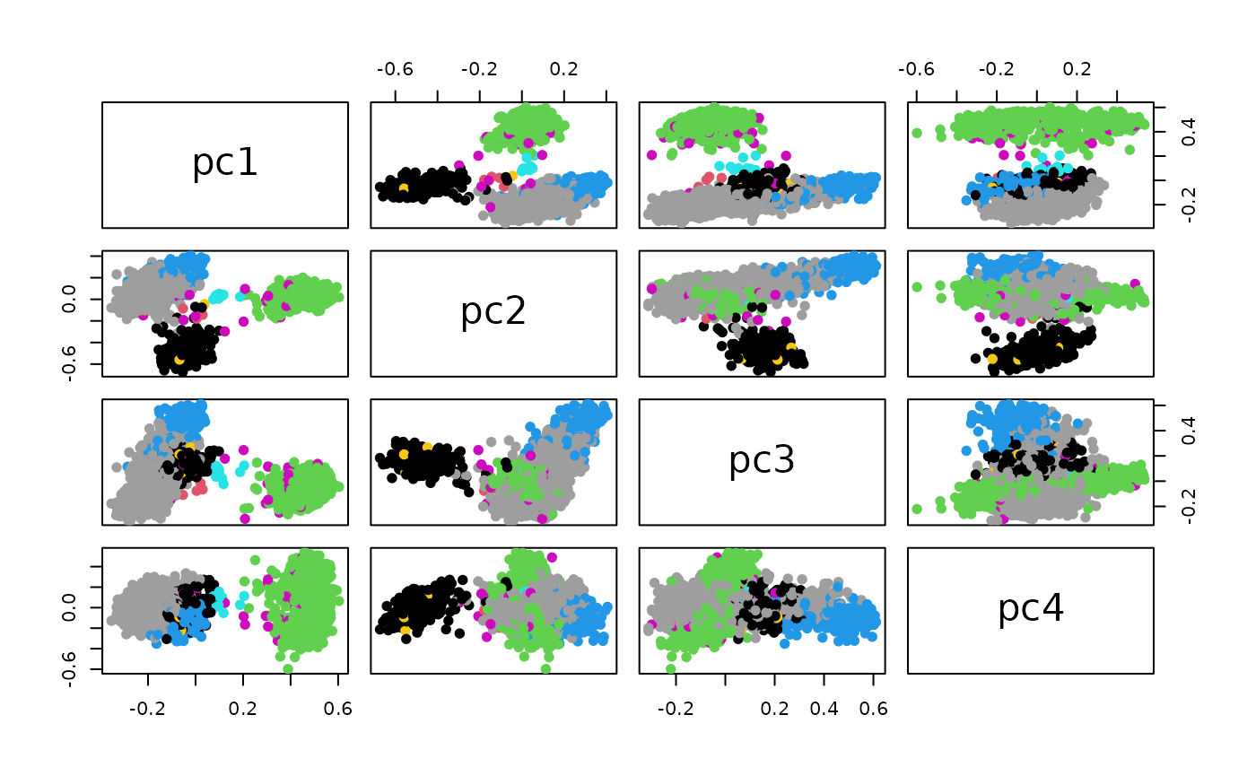
Let’s drill in on the PC1 x PC4 display:
plot_ly(data=cud, y = ~pc1, x = ~pc4, color=~celltype)## No trace type specified:
## Based on info supplied, a 'scatter' trace seems appropriate.
## Read more about this trace type -> https://plotly.com/r/reference/#scatter## No scatter mode specifed:
## Setting the mode to markers
## Read more about this attribute -> https://plotly.com/r/reference/#scatter-modePCA based on the normalized counts:
cp = prcomp_irlba(t(assay(t3k, "logcounts")), n=10)
cud = data.frame(pc1=cp$x[,1], pc2=cp$x[,2],
  pc3=cp$x[,3], pc4=cp$x[,4], celltype=t3k$celltype)
pairs(data.matrix(cud[,1:3]), col=factor(cud$celltype), pch=19)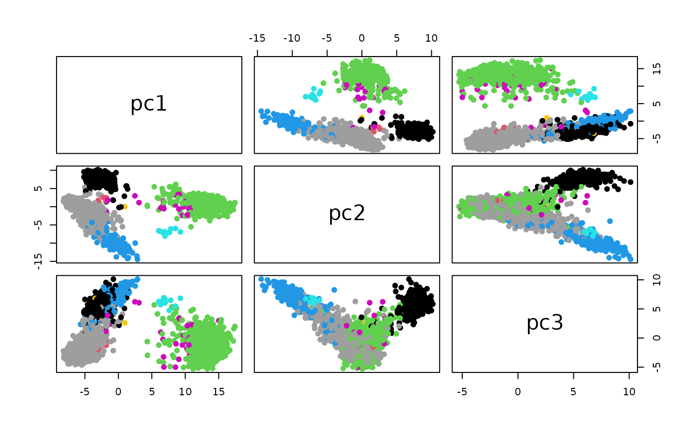
Gene barcodes
The estimated probabilities linking genes to cell types are ordered to produce barcode displays.
data(nn50)
data(t3k)
t3k = add_simba_scores(nn50, t3k)
gns = c("CST3", "NKG7", "GAPDH", "MS4A1")
alldf = lapply(gns, function(x) simba_barplot_df(t3k, x,
  colvars = "celltype"))
alldf = do.call(rbind, alldf)
ggplot(alldf, aes(x=rank,xend=rank,y=0, yend=prob,colour=celltype)) +
  geom_point() +
  geom_segment() + facet_wrap(~symbol, ncol=2) +
    theme(strip.text=element_text(size=24),
      legend.text=element_text(size=24),
      axis.text=element_text(size=24)) +
    guides(colour = guide_legend(override.aes =
       list(linetype=1, lwd=2)))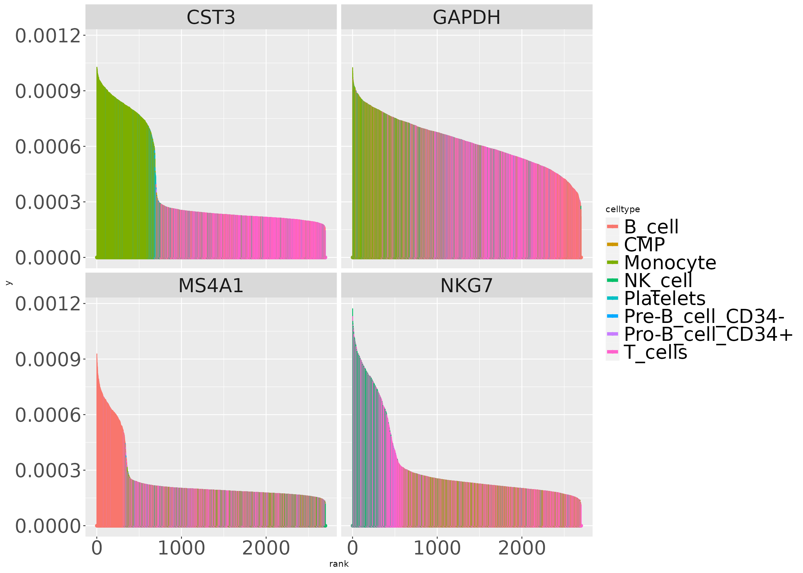
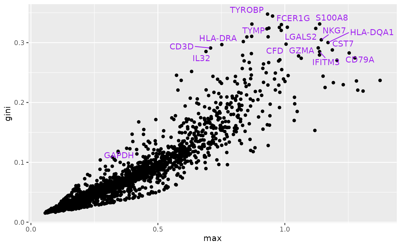
Cell-type marker assessment via Gini index
At this time our implementation of the ‘max’ metric is not faithful to the simba modules. But the following code chunk comes close to producing Figure 2e of the SIMBA paper.
# t3k = add_simba_scores(nn50, t3k) # already done
gi = gini(t(assay(altExps(t3k)$sprobs)))
ma = as.numeric(max_scores(t3k))
mydf = data.frame(max=as.numeric(ma), gini=gi, gene=rowData(t3k)$Symbol)
litd = mydf[order(mydf$gini,decreasing=TRUE),][1:25,]
hh = mydf[mydf$gene=="GAPDH",]
litd = rbind(litd, hh)
mm = ggplot(mydf, aes(x=max, y=gini, text=gene)) + geom_point()
mm + ggrepel::geom_text_repel(data=litd,
          aes(x=max, y=gini, label=gene), colour="purple")
## Warning: ggrepel: 10 unlabeled data points (too many overlaps). Consider
## increasing max.overlaps