C1 Cancer in our bodies: Overall view
Vincent J. Carey, stvjc at channing.harvard.edu
May 22, 2026
Source:vignettes/C1_body_overall.Rmd
C1_body_overall.RmdCancers originate in specific organs
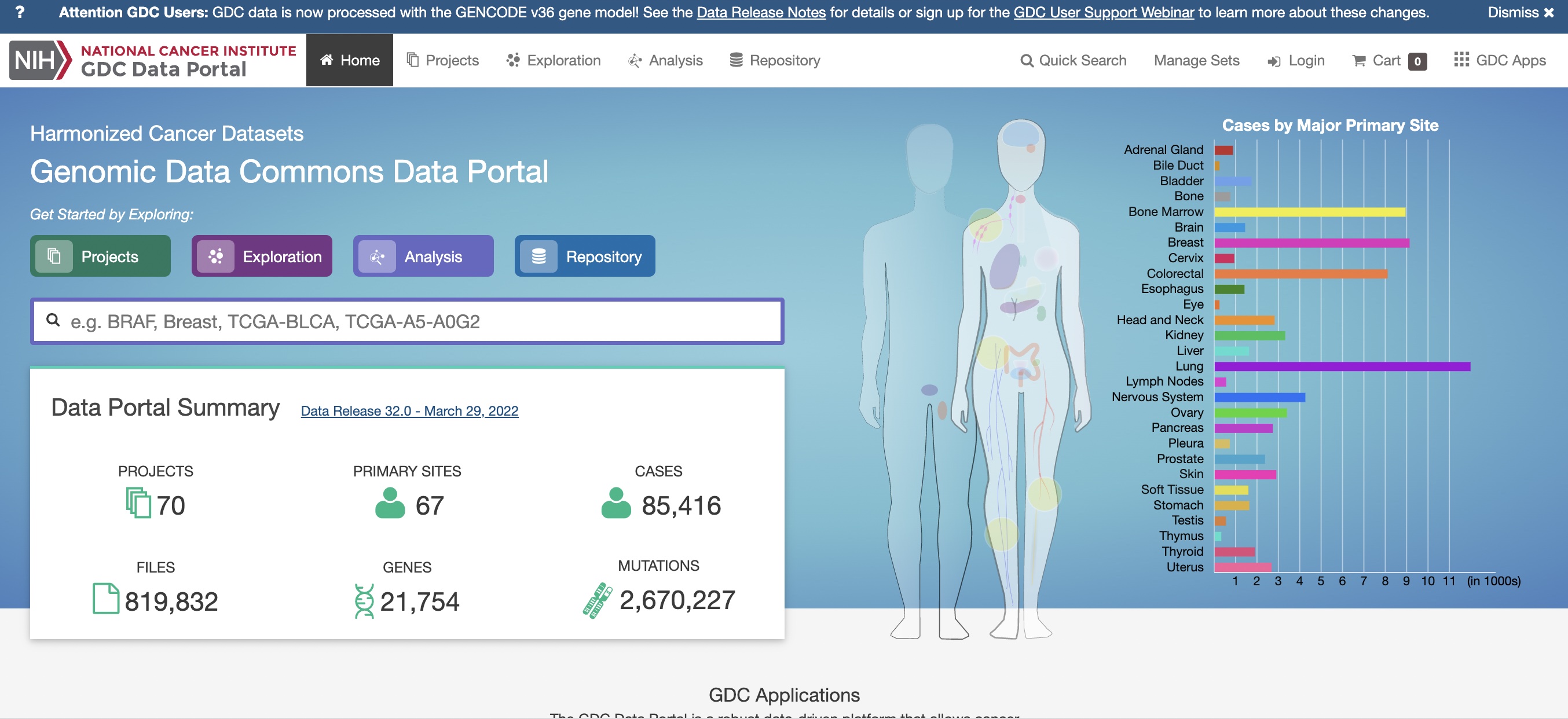
Overall, data commons
This display can be found at the NCI Genomic Data Commons.
Resources for basic research
The Data Commons centralizes cancer data resources from a variety of large-scale basic research projects. It is not used to record population-level information about ongoing cancer risks.
Click on the right shoulder of the female form to find
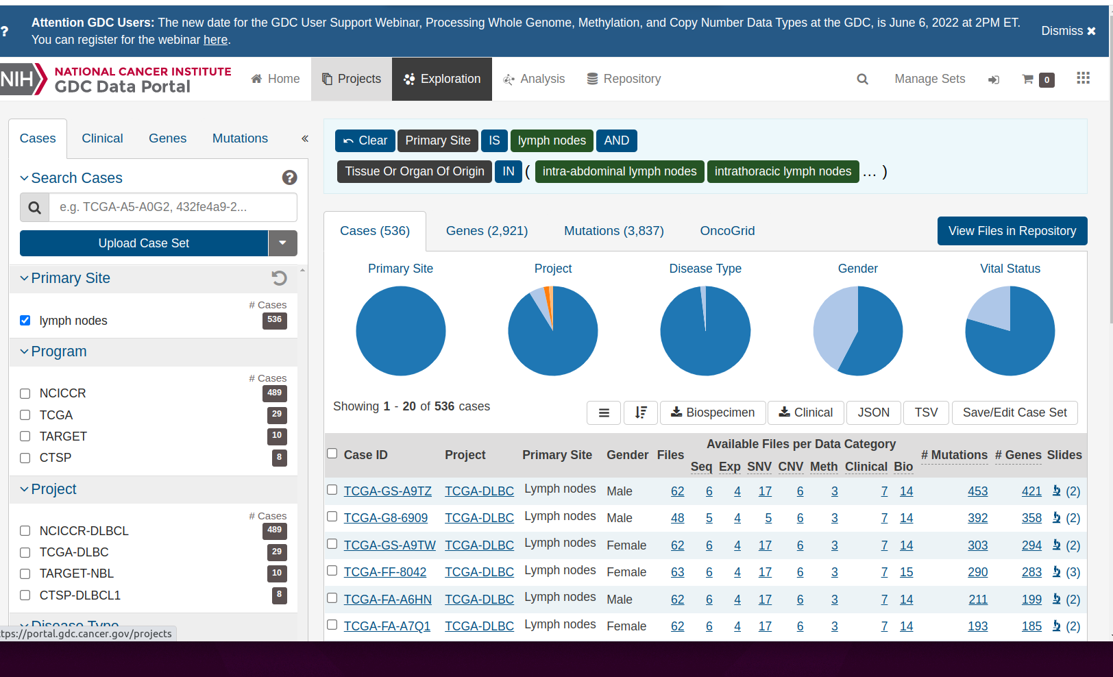
Lymphatic cancers
Notice the description of the logic of selecting the ‘shoulder’, which contains an icon depicting lymph nodes. There are tiles expressing the logic of selecting information on lymph nodes from the data commons. “Primary Site” IS “lymph nodes” AND “Tissue or Organ Of Origin” IN and then a parenthesis begins. Click on the ellipsis to reveal the full set of lymph-related tissues:
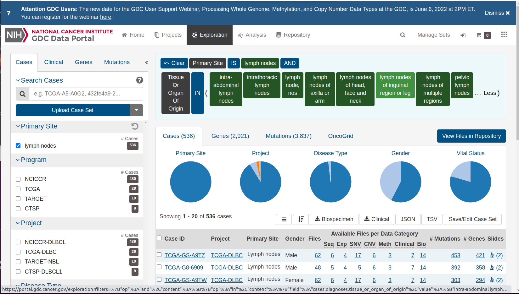
Details of lymphatic cancers
If we “clear” the selection, we get a complete overview of all studies and cancer types.
Selection cleared
Resources on the burden of cancer in the population, by primary site
The Genomic Data Commons gives an overview of resources for basic research in cancer. Epidemiologic research is conducted at the population level, and includes efforts to identify all reports of cancer diagnoses throughout the United States.
There is generally a time lag for collecting and processing data. Estimates for 2018 and later years are still being developed.
Summarizing annual changes in rates
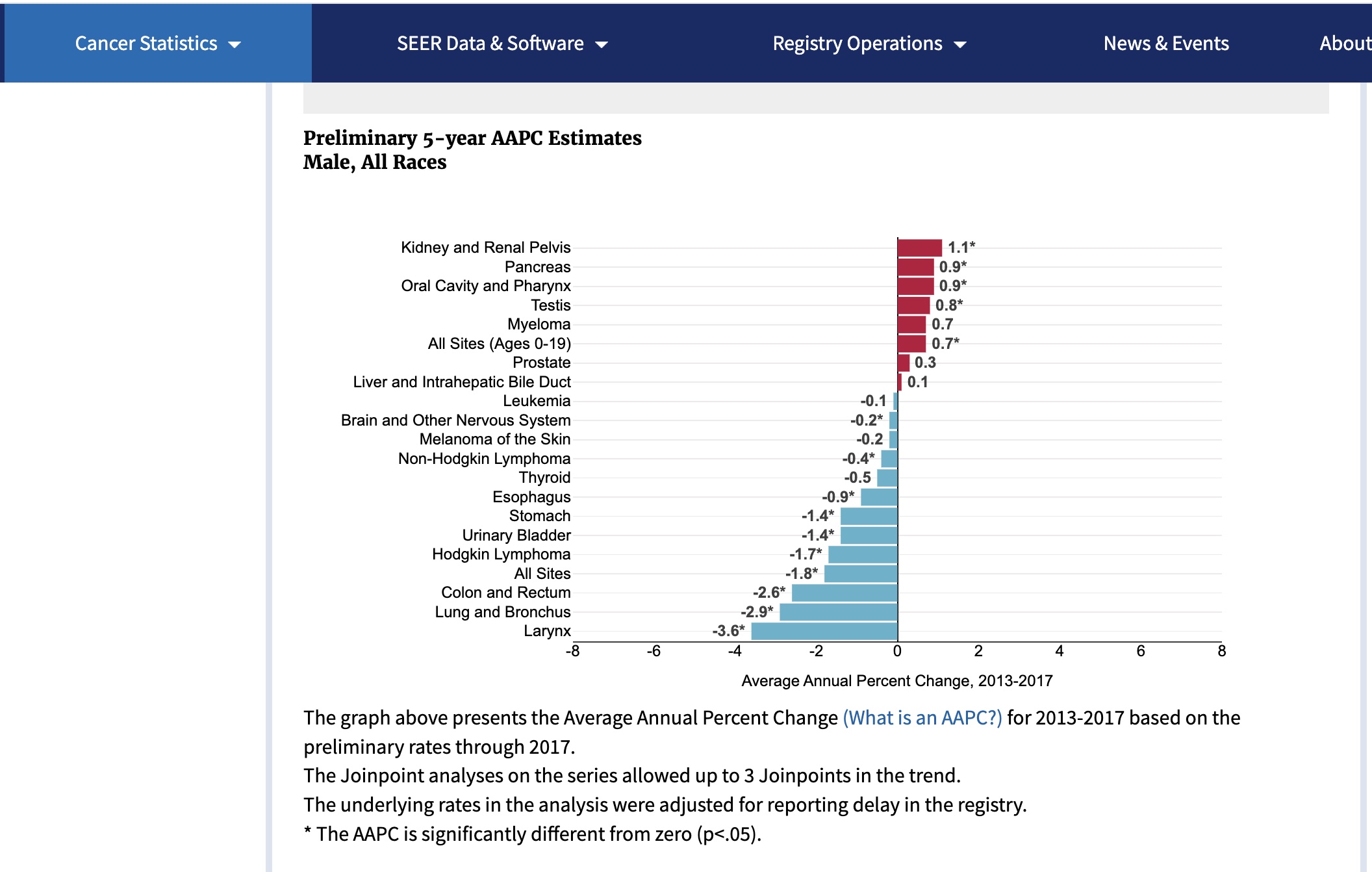
In these displays, the focus is on changes in the population burden. The Average Annual Percentage Change (AAPC) is a number we want to be negative. This would indicate that the risk of this type of cancer is diminishing over time.
SEER (Surveillance, Epidemiology and End Results) estimates for 2017 for males:
SEER2017 male
For females:
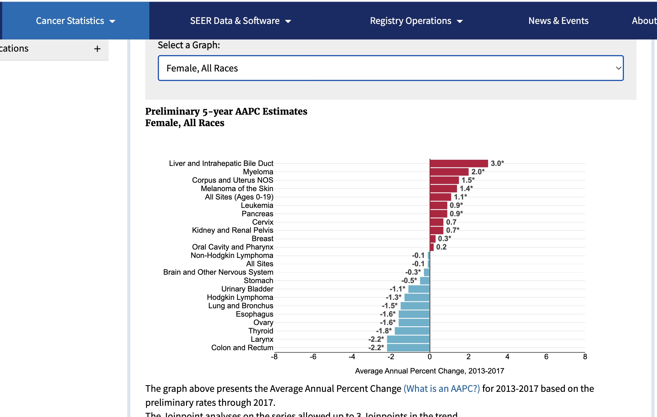
SEER2017 female
Detailed visualization of the trends
We have a table distributed by the SEER program.
data(SEER_2018)
datatable(SEER_2018[,2:6])
This can be used to visualize trends over time.
mkid = SEER_2018 |> dplyr::filter(CancerSite == "Kidney and Renal Pelvis" & Sex == "Male")
fcol = SEER_2018 |> dplyr::filter(CancerSite == "Colon and Rectum" & Sex == "Female")
with(mkid |> dplyr::filter(Race=="All Races"), plot(rate.2.2018~Year, ylab="Incidence per 100000", xlab="Year",
    main="SEER Kidney and Renal Pelvis, Male"))
with(fcol |> dplyr::filter(Race=="All Races"), plot(rate.2.2018~Year, ylab="Incidence per 100000", xlab="Year",
    main="SEER Colon and Rectum, Female"))
The plot for Kidney and Renal Pelvis cancer for males shows a difficulty with summarizing rates by a single number (e.g., average annual percentage change). The rates can change in complex ways owing to
- changes in approaches to screening
- logistical problems of reporting
- improvements in preventive strategies
Epidemiologists try to uncover causes of changes in rates, and produce methods to reliably summarize them in the face of these complications.
Cancer subtype hierarchy
The lists of cancer sites we’ve seen thus far are fairly informal. Cancer subtypes can be identified by various methods, with implications for prognosis and treatment.
The oncotree resource at Memorial Sloan-Kettering presents a snapshot of current thinking about relationships among cancer types.
Below is a small excerpt from the oncotree, showing a subset of subtypes of brain cancer types. Many of the nodes on the right can be expanded to reveal additional subtypes.
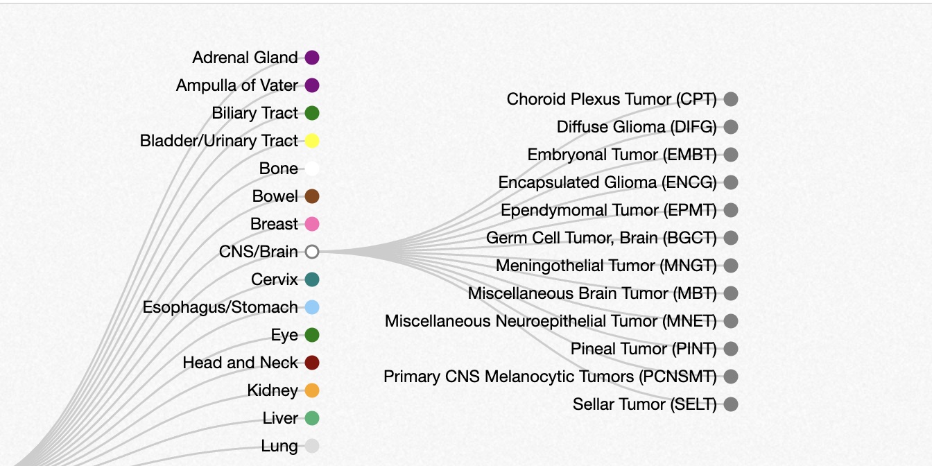
Oncotree snippet